Sunday 18 December 2011

Christmas Presents: Wall Decorations (Part 1)

Hello! Long time, no blog! Yes, it's that time of year again, where everything goes a bit haywire - and then eventually settles down well after the new year has begun. Bring it on I say!

So I decided to make a few Christmas presents this year. I have been very busy to say the least. I did get to a point where I was questioning my motives for doing so - is it so I can save money, show off my skills or just purely because I enjoy giving my creations away to a deserving home? Honestly, these statements couldn't be further from the truth. I actually find: I spend more time making presents (which ='s money); most of the time my skills (unfortunately) aren't appreciated; and, it very difficult to part with the creations I make (as I believe they are almost an extension of my very being). I'm still not sure why I wanted to make Christmas presents - and will definitely be reminding myself of this fact next year.

Despite my rant - it gives me further opportunity to show you what I've been up to. These two projects are "hot off the press" - and will be given to my nieces on Christmas day. Hopefully they will treasure these for some years to come!

I seem to be all about Kaisercraft products at the moment (which will be true for the next couple of blog entries). This is only because I bought up big during the latest sales at both Kaisercraft and Spotlight and my craft cupboard is overflowing with stuff!!

Kaisercraft has brought out a new product range - wall decoration shapes - that come in all different sizes. I chose to decorate a butterfly and a teddy bear - one for each of my nieces.

Prepping the surface:


Butterfly: I started on this wall decoration first. Decided to paint two coats of
gesso primer on the front, and one on the back.
It was fun having to also paint the sides of this shape! (Not!!)


Teddy Bear: Similar to the butterfly. I noticed the shape was a little bit more
rough around the edges. I took extra care sanding him once the gesso primer was dry.

Painting the base coat:


First attempt: I decided to paint Derivan Matisse Structure paint "Purple Dioxide" straight from the tube onto the front surface. Turned out black, flat and lifeless. Not something you'd want to decorate a 4-year-old's bedroom with. Even my husband agreed!


Second attempt: Happy this time around. Added Iridescent Medium to the purple dioxide paint, which just lifted the colour immensely! You can see the difference here between the plain and the iridescent sides. 


Final result: An iridescent, purple butterfly!


First and final result: I didn't even try to attempt to paint straight from the tube for the teddy bear (given the initial results of the butterfly). I added iridescent medium to Derivan Matisse Structure paint "Crimson Red". I think the results speak for themselves!

Decorating:

I actually managed to not take any photos of the butterfly as I was decorating it. I used Jo Sonya's Opal Dust - painted this on the front only. I know kids just love things that sparkle!

For the teddy bear, I took a different approach - and used "rub-ons" (stickers that are pressed onto an object, usually by using a paddle pop stick or something similar). This was because there was a lot of empty space on the legs, and I also found these really cute, bright and bubbly rub-ons.


Work in progress: Half done here. The right leg has already had its rub-on stickers applied. On the left side, you can see that I'm in the middle of making sure the stickers are in the right spot. 


Final result: I did a fair bit of trial and error prior to adhering these stickers to the teddy bear. I found that rub-ons can be applied to MDF (wooden) surfaces. However, if the surface has been primed and painted this produces much better results, particularly as the stickers remain in place!

Applying patterned paper to the gaps:


Animal paper: Applied to the teddy bear. I thought it would be a great idea to "feature" some of the animals in the cut out holes that were left for the tummy, nose, mouth, ears and eyes. I even made the eye shape out of the octopus head (far top left corner). (See final results below.)


Polka dot paper: This paper is just gorgeous! Worked really well with
the iridescent purple and opal dusted butterfly!


Work in progress: The way in which I attached the paper to the backs of the animal shapes
- using double sided tape!! 

The final product:


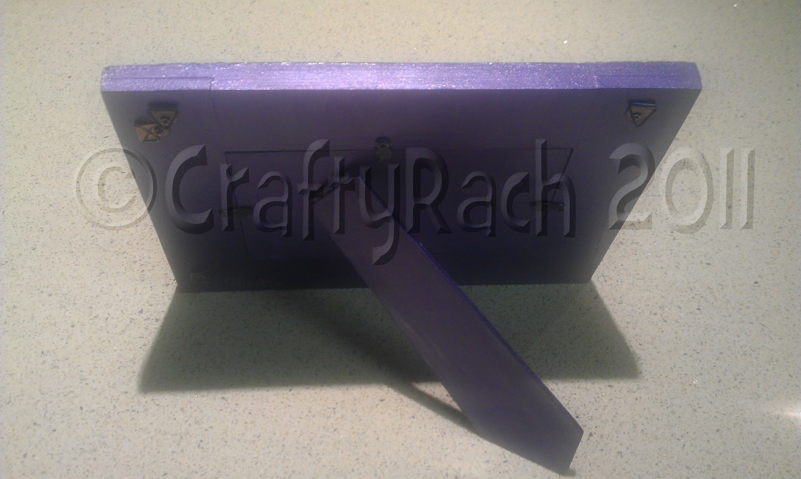
Back: To be attached to the wall using double-sided tape or something similar.


Front: Once finished, I added jewels to the middle of the butterfly. It's my Mum's favourite.


Back: Doesn't necessarily have to be neat as the back will be pinned to the wall.
The other thing that made it tricky to have it neat was the fact that I aimed
to feature different animals in the cut out holes.


Front: Oh look there's a Giraffe! And an elephant! And if you look harder
you might be able to spot a lion, crocodile, turtle, whale...


All in all, I'm glad these have been finished in plenty of time before Christmas!

Crafty Rach xo

Friday 11 November 2011

Bling It Up: Personalising Your Space

I have a confession to make. I'm in love...not only with my hunky and talented husband, but also with one of the greatest craft/scrap booking supplies places I have ever found - Kaisercraft. Kaisercraft has several outlet stores in Australia, one being in Robina on the Gold Coast. I am thankful that I live in Brisbane, otherwise I would be there every day - spending money.

My friends will vouch I am obsessed. When we were there last time, I drooled over everything, took my time picking up bits and pieces and not surprisingly was the last one to leave the store with my very big bag of goodies. Kaisercraft Robina recently had a 20% off sale, so off I went, with lovely hubby in tow, and spent up a storm (much to my husband's feigned delight). "A happy wife, is a happy life" - right?

While I was there, I was inspired to add a couple of more craft projects to my ever-burgeoning list, one of which was the "Bling It Up" Project.

I thought it would be perfect to purchase the first initials of my husband's and my names ("N" and "R"), paint them up, cover them in self-adhesive jewels and put them on display in our living room area.

In the beginning: The plain MDF wooden letter "N".

As always for my wooden projects, I primed each letter's surface with two coats of gesso paint, to prevent the wood from absorbing the coloured paint to be painted over the top. This time I used a different brand of gesso, Chromacryl. My brief review of the product is that it definitely has more coverage compared with other gesso products I have used. Once dry, the result is a fine "tooth" finish - which can either be sanded gently or left as is.

Primed and ready: The letter "R" with two coats of gesso applied.

I had already decided that the "R" would be painted in Derivan's Structure Matisse paint "Magenta". However, I needed to visit my local Riot Art and Craft supplies store to choose the colour for "N". I knew it had to be blue (husband's favourite colour) - and had researched the many different colours of blue via Derivan's website. However, one can never really tell how a colour is going to work out by purely looking at their computer screen! It's definitely best to go in person and choose the colour off the shelf.

I ended up picking Derivan's Structure Matisse paint "Ultramarine Blue". It's an interesting paint colour, not just for its vibrancy, but also for its finish. Unlike other Structure Matisse paints, Ultramarine Blue dries as a matte finish. Most other colours I have worked with so far have dried with a distinct glossy look.

Both letters required a minimum of three coats of paint. Upon application of each coat of paint, the base coat took on a darker hue. Once dry, two coats of gloss varnish was applied to both sides of each letter.

Work in progress: "N" and "R".

The final stage of the project was definitely my favourite. I had purchased packs of round and flower shaped self-adhesive jewels to stick on the front side of both of the painted letters. I decided that there wasn't going to be any order to where each jewel was going to be placed. Nevertheless, I did decide to start with sticking on the larger shapes first.

"R": Bigger shapes were stuck on first.

However, almost at the end of this process for both letters, disaster struck! I had run out of jewels!!

Almost there: Needed more jewels!

A quick dash to my local Spotlight store allowed me to buy a few more packs - phew!!

And here are the finished products!!


In-situ: "N" and "R", blinging up and personalising our living room area!!

Love it!!

CraftyRach xo

Monday 7 November 2011

The Three Amigos: A Gorgeous Cacti Plant Display

Ok, I know it's been a couple of weeks since my last post. It doesn't mean that I've taken a break from being crafty!! I've added several more creations to my collection of arts and crafts - which will all be revealed soon!

I think "The Three Amigos" project has been one of my most challenging to date. Not because it was difficult to complete, but I didn't have a clear direction as to how it would work out in my head!

I was given three small terracotta pots for my birthday just gone. They looked cute and suitable for growing herbs. Each pot also had a painted black space, allowing one to write the name of the planted herb in chalk. However, something was off with the colour - they were a light blue (the kind of blue that is used to paint the inside of a pool), that clashed with the place where I was going to display them, my kitchen.

Inside of pot: Original colour - "pool blue".

All three pots: Primed with gesso paint, black area kept unpainted.

I did look into buying paint that would be suitable for painting a terracotta surface. In the end, I decided to keep using my acrylic-based paints as the pots would be inside and not exposed to the outside elements. I had to prime each pot with several coats of gesso as the terracotta kept on "sucking up" (absorbing) the paint.

I then decided to use "Brilliant Alizarin" (a crimson colour), to compliment my kitchen's colour scheme (browns, silvers, whites, slate). Each pot was painted with several coats. Nevertheless, once I was done, I felt the colour looked flat and faded. I then mixed into the crimson colour, Derivan Matisse's acrylic paint medium, "Iridescent". After another coat or two, the pots looked more lively.

(NB: I didn't worry about painting the inside, as this won't be seen in the end.)


Before: Pots painted with "Brilliant Alizarin" only.

After: Pot painted with "Brilliant Alizarin" + Iridescent medium.

Seeing as the pots were going to be used as herb planters, I thought I would paint green grass on the back and front of each.

Front

Back
 
The green turned out black, and I was just so disappointed with the result. I even tried sprucing up the front black area with a border of silver paint.

Front: Silver border.

One word: Disaster!

I had a lot of my friends and family say it wasn't too bad. I kept on shuddering every time I saw them - I knew something was wrong. I guess the premise that they were also going to be used as herb planters was also not sitting well with me. 

Back to the drawing (or shall we say "Crafting") board!

I decided to use my acrylic Metallic Silver colour and paint over the entire surface of each pot, including the mini-blackboard at the front.

Silver Pot: Needed to use several coats of Metallic Silver paint to cover the crimson colour!

I also wanted to feature a couple of red lady beetles on each pot. I wanted to make them look 3D like. I used pebbles (or "Glass Nuggets") that I had from a previous project, primed them with gesso paint, and once dried painted them red and dabbed black spots on top!

Glass Nuggets/ Pebbles

 Pebbles: Painted with gesso.

Pebbles: Painted crimson .

I then stuck the pebbles onto the front of each pot with my glue gun.

Three pots: Almost there!

I painted on black antennas and black swirly, curly vines on the back for completeness.

I then went out to my local Bunnings Hardware Store, and found some awesome Cactus Plants! This was what I was missing! I was so excited to have three different-looking plants, that would need low maintenance and water and lots of sun (as they were to be placed under my kitchen skylight).

I also was thrilled to find some small terracotta plates to put underneath my pots.

Terracotta plates

Terracotta plates: Painted with gesso.

Once finished, I varnished all surfaces with a gloss. I also applied felt to the bottom of each terracotta plate, to prevent scratches on my caesar stone bench tops!!

Here's the finished product:


 The Three Amigos: Home at last!

The Three Amigos

From a disaster, it is amazing what one can achieve.

Crafty Rach xo

Sunday 23 October 2011

The Flame Tree: A Beautiful Jewellery Stand

A couple of weeks ago, I posted a few pictures of the Flame Tree that was in my grandparent's garden. I used its colour scheme to help me design and finish my latest creation. I absolutely love this colour spectrum - a warm colour palette as some might say - from a deep magenta colour, all the way through to a lovely sunny yellow. (I know the leaves were also green in places, but for the purposes of what I wanted to do, I didn't venture into adding similar colours.)

I picked up this project from Spotlight. Kaisercraft produces unfinished MDF projects - one of which is a family tree.


I had seen a suggestion that one could easily take away the backing part of the tree, just leaving the intricate detail of the branches and leaves, allowing it to be used as a jewellery stand instead.


To make sure the finished product looked good, I primed the surface and sanded it back.


Instead of mixing the individual colours on a separate surface, I decided to add the colours to the MDF surface as I went. This was a bit risky as there was a possibility that I would just make a mess and not show a progression between the different colours, but I had faith in my ability to get it right.

In hindsight, I could have taken photos of this process, but I guess I was too caught up in it, and by the time I realised I was finished - it was too late.

I started off with Magenta at the "trunk" of the tree, moving through to a Brilliant Azure colour (Red), then progressively mixed in a Sunny Yellow to produce an orange colour. I then cleaned off my brush to ensure the Sunny Yellow colour was applied cleanly to the tips of the flame tree (without trace of any other colour paint).

The one pain point with this project was having to paint the sides of the trunk, branches and leaves - they were so intricate!! It took me at least four hours to paint.

And of course I then finished it with Jo Sonja's Opal Dust and a Gloss Varnish.


Front


Side detail

Back

Just love this!!

Crafty Rach xo

Friday 14 October 2011

Progress Update...

Thankfully I haven't had to write a progress report in ages!

However, I thought I would blog about what I have achieved this week. I have officially finished four projects that were on the go. One of which was: Turning "Trash" into Treasure .

I'm very proud of myself for sticking to my goals and persevering with what has seemed to just take forever to finish!

Here's what you can look forward to over the next couple of weeks (in no particular order):
Crafty Rach xo

Thursday 13 October 2011

Turning "Trash" into Treasure: The Amazing Photo Frame Transformation

Picture this. You are hosting your own gathering. Whether it be for a birthday, engagement or even a wedding. People are giving you what seem to be amazing gifts judging by the brightly coloured wrapping paper and elaborate ties and bows. But the excitement disappears as soon as you open these hand-picked presents. "Oh, how lovely," you gush as your guest smiles, thinking they got you just the thing you needed for your house/kitchen/bathroom. Meanwhile, deep inside you are thinking, "What am I going to do with this thing? It's totally going to clash with my current decor!" Even worse: "I hope they won't know I threw it in the trash!"

Has this ever happened to you?

Throwing these unwanted items away is one thing, but I also know of people (and am one myself) who store these unwanted presents away in what is termed a "Present Cupboard". These unwanted presents are typically re-gifted to relatives and/or good friends - which only serves to perpetuate the cycle of poxy gift giving. I have been guilty of re-gifting at times. My re-gifting rules of thumb however are:
  • the item must be something I like
  • the item is decent and in good condition and 
  • the item has never been seen before by the receiver (particularly important).
However, now I believe I have another solution to stop the cycle of poxy gift giving for good! That's right - get crafty!

My friends had been given a picture frame for an engagement/wedding present. They'd kept it in the cupboard for a while, but then thought I might have better use for it.

I remember first seeing it and thinking it needed sprucing up - originally an all white, quintessential "weathered" wood frame. (Please note: I started this project before I decided I would keep a blog, so unfortunately I have no before photos!)

I made sure the surface had been primed properly - using my Gesso paint. When the surface was dry, I sanded the frame, to make the wood as smooth as possible. It was always going to be the case that the "weathered" texture would still come through, but it wouldn't be as obvious.

Using "Dioxazine Purple" from Derivan's Matisse Structure Paint range, combined with an iridescent medium, I managed to cover both the back and the front of the frame. The frame also had little beach objects set in each of its four corners. Instead of keeping them the same colour as the rest of the frame, I decided to make them stand out more by painting them silver. (Whereas, originally these features blended in with the rest of the frame.) I dusted a bit of purple paint over the ridges of the shapes, to define them a bit more.

Here's a couple of photos of how the frame looked after I had done this:


Beach frame: A work in progress.


Bottom left corner: I also highlighted the little starfish and rocks
set around the main shell with silver paint.


Top right corner


Bottom right corner: Starfish - this feature was a little tricky to paint
due to its indented texture.


Top left corner

I thought I was finished at that point. However, I knew there was still something missing. Then came along Jo Sonja's Opal Dust - a finishing product I found during the completion of "A Jewellery Box" project. Awesome stuff! I then varnished the frame with a gloss, to preserve the paint. The final product is certainly a far cry from its original state!


Top right corner

 Bottom right corner


Bottom left corner

Top left corner


Back


The finished product

Now it's just a matter of finding the perfect photo! Thanks and with much love to C and P for the frame (you know who you are)!

Crafty Rach xo